
Exploring the latest from the Logik.io Commerce Logic Engine
Original Post: Test Drive – Logik.io on Salesforce CPQ
Related References:
- Logik.io website
- Logik.io on LinkedIn
- Logik.io on Salesforce CPQ
- Logik.io on AppExchange
- Logik.io YouTube Channel
- Salesforce CPQ External Configurator Documentation
Background
Last year I reviewed the new Logik.io configurator experience available for use with Salesforce CPQ. That article can be found under Test Drive – Logik.io on Salesforce CPQ. Since that time, Logik.io has had a ton of feature releases (every ~2 weeks), and I have been unable to keep up on trying out the new toys. I’m trying to start 2023 off right by exploring what has changed, and will share a few big-ticket items in this post. Of course, this only scratches the surface of what would be worth covering.
As part of checking out the latest features, the perspective taken will be a mix of end user and administrator experiences. I’ve set up a rudimentary example of configuring a quote for new computer equipment, which we’ll use to aid in the demonstration.
Layout Wizard
Let’s start off with a bang. A new Layout Wizard for building configurations via the UI was recently released. This is an extremely impressive feature that will allow administrators to easily build layouts to meet any business requirement. Walking through a simple example will highlight the power of this new capability.
The first step is to select from a number of pre-built templates, which represent the different combinations of available components within a layout. Even more eye-catching is the fact that each of the template thumbnails is fully interactive and thus allow you to see how the navigation will behave without having to go through a frustrating trial and error process. Shown below are only a couple of the many options available — zoomed in to demonstrate the ‘living’ nature of the selection process.
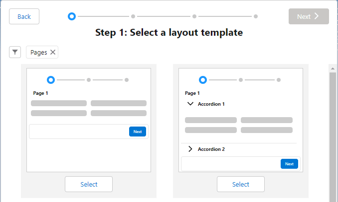
After we select a base template, we’re given the ability to customize the layout to our heart’s content. For our example, let’s make the quote a guided walkthrough allowing selection of a computer system, addition of accessories, and finally entry of special instructions. In the layout template selection, I’ve chosen the paged layout along with a running product list to track selections.
The layout editor allows the creation and removal of additional pages, as well as the ability to name those pages.
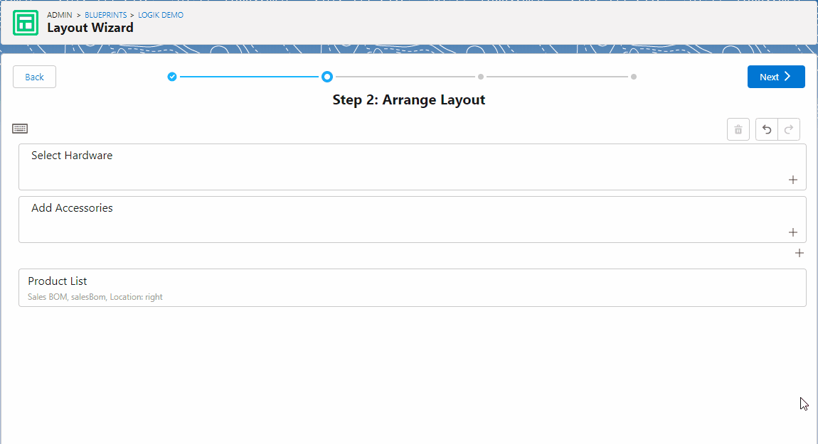
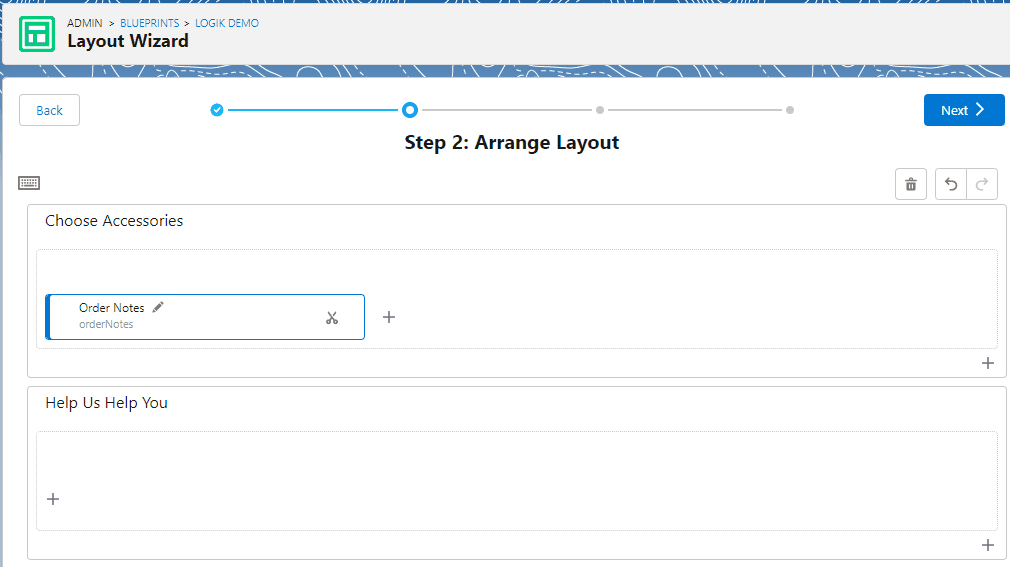
Once the pages are structured and named the way we want, we add the fields (or remove them just as easily – done here via keyboard shortcuts).
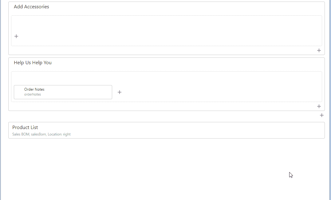
We can then arrange within the pages/sections as needed. Notice as well the ‘Undo’ and ‘Redo’ options, which are also available via keyboard shortcuts. Demonstrated below is the arrangement of fields using both mouse and keyboard.
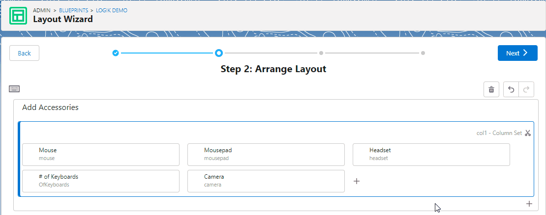
Another very helpful feature in building layouts is the ‘Cut’ & ‘Paste’ tool that allows us to re-arrange fields, sections or pages, while preserving everything else in the container. As with ‘Undo’ and ‘Redo’, these commands support keyboard shortcuts. Due to its ease of use, and the ability to immediately receive visual feedback, experimenting with different configuration experiences is a breeze with the Layout Wizard.
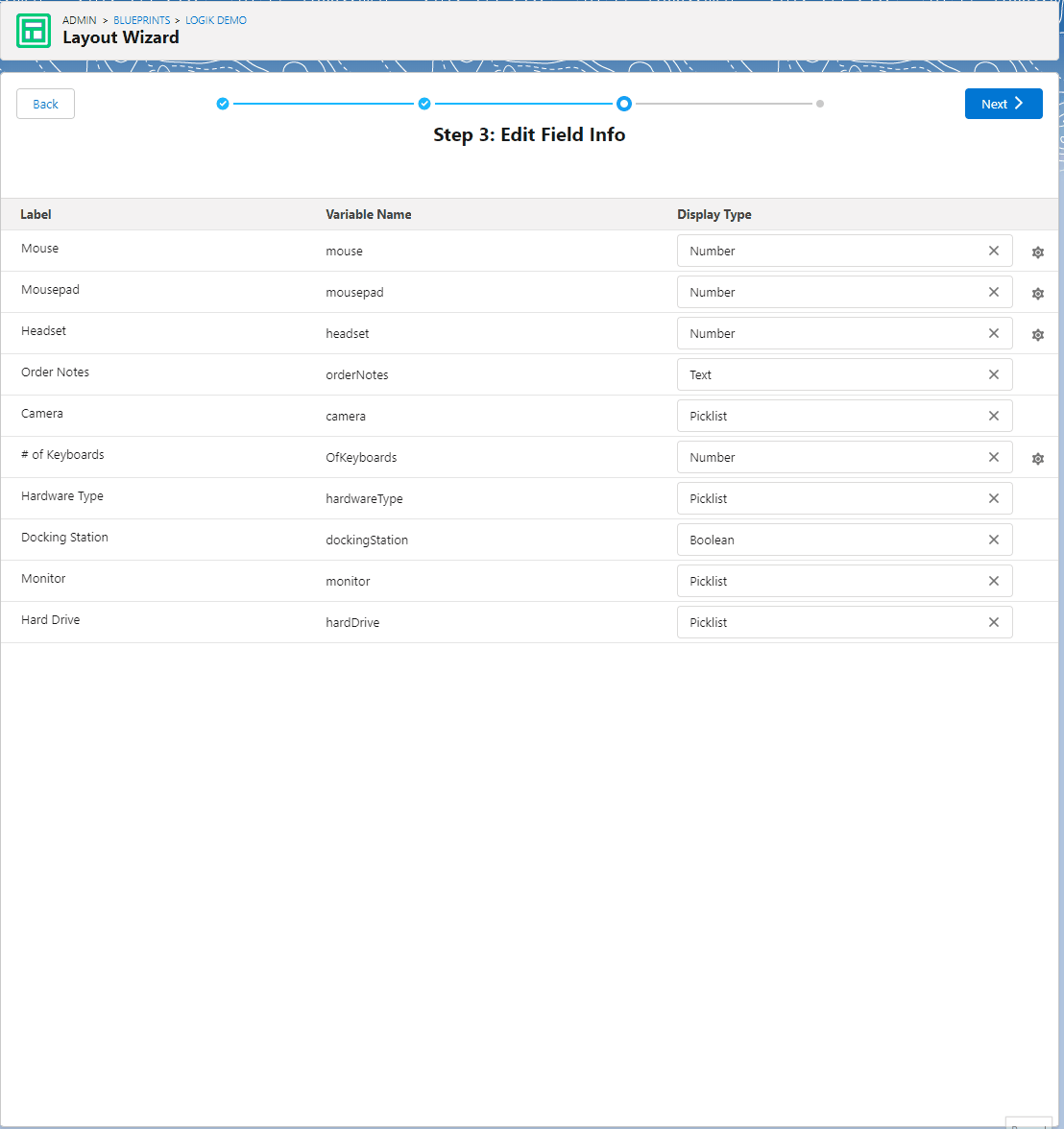
For the final step, we’re given an option to change the display options for the fields on the layout. To assist in making this selection, the layout wizard provides a an incredibly helpful visualization of what each display type will look like so we can make a selection without any guesswork! For example, we can set a Number field to display as a Number, a Number with Submit, a Slider or as Display Only. Based on that selection, we can then adjust the range, precision, symbol and units. For Text, we can use Text, Text Area, Date or Read Only. Picklist offers a number of interesting options: Horizontal Radio Buttons, Vertical Radio Buttons, Visual Picker, Radio, Picklist and Read Only. Visual Picker allows for images to be used for each selection, which offers the user a mechanism for visual configuration. Where Picklist Extensions are used, additional presentation options for those fields are also available. For Boolean, we can use Toggle, Radio or Radio Button also. Check out the guided selection tool below!
Once done with these our configurations, we save the layout and it is now available for use in our configuration (Blueprint). As a reminder, Logik.io allows for multiple active layouts per configuration, which allows for some choice at the user level with the ability to switch between preferred layouts.
The Layout UI Wizard is a real game changer in terms of administrator accessibility, and I’m really excited to see what comes next in this area.
Navigate Configuration Relationships with HyperJump
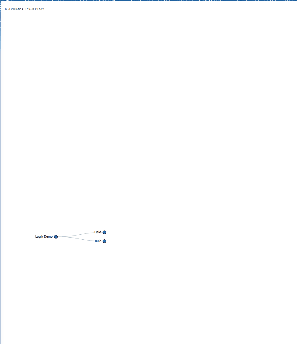
HyperJump is a really interesting tool that provides a navigable visualization of a product being configured. Below I’ve shown the full map of our simple computer configuration example called ‘Logik Demo’ by clicking through the Fields and Rules nodes of HyperJump.
The end points even allow an option to Edit, which allows us to maintain Fields and/or Rules without leaving the visualization.
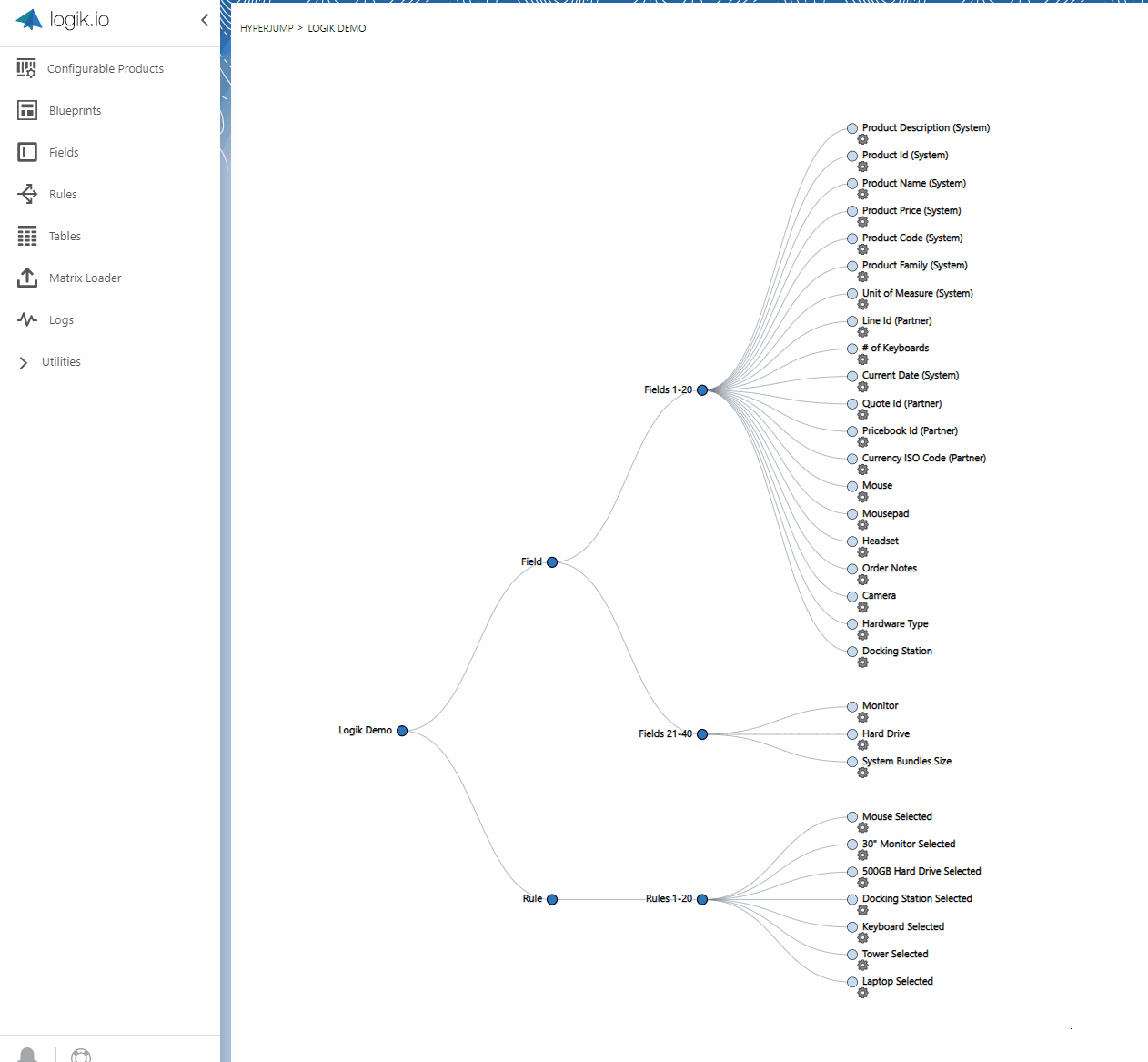
HyperJump provides a great option to navigate through different levels of a configuration setup from a common viewpoint.
Configuration Experience Highlights
Finally, let’s turn to some user experience items that further set Logik apart. Recall from my last review that a few of the common issues orgs face on Salesforce CPQ are the lack of UI customization, slow performance with larger configurations, and the inability to provide an informative guided experience for the quoting user. As discussed in this post as well, Logik.io provides a wide variety of UI customization options, and these are growing by the release. In my previous post I also focused on the speed of the quoting experience due to the rules engine underlying Logik.io, and this quantum improvement continues to shine. Let’s now look at a few of the latest changes that further add to the guided quoting experience.
Something that may seem insignificant at first glance, but turns out to make a huge difference in the quoting process, is the availability of targeted information messages at the time and location that they are required. In Rule selection, an admin can select info, warning, or custom messages, choose an icon (or point to a custom one), customize the color of the message, and set what it should say, as well as where it should be displayed.
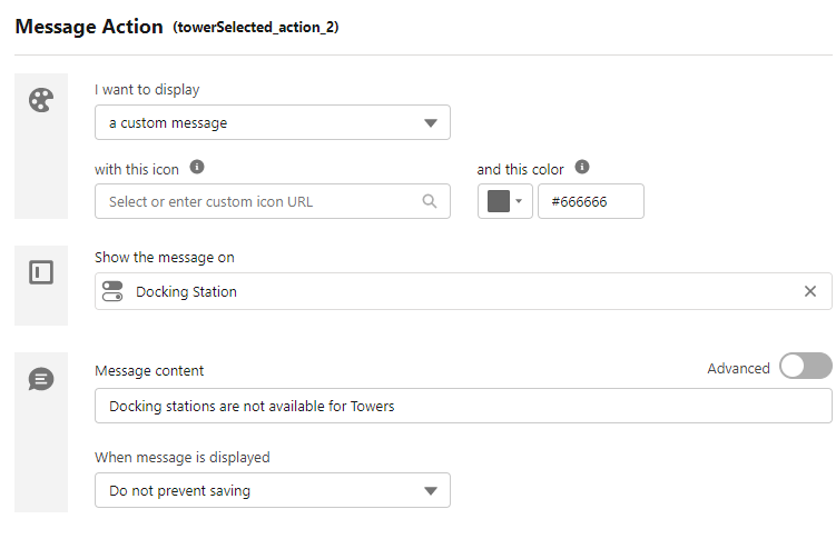
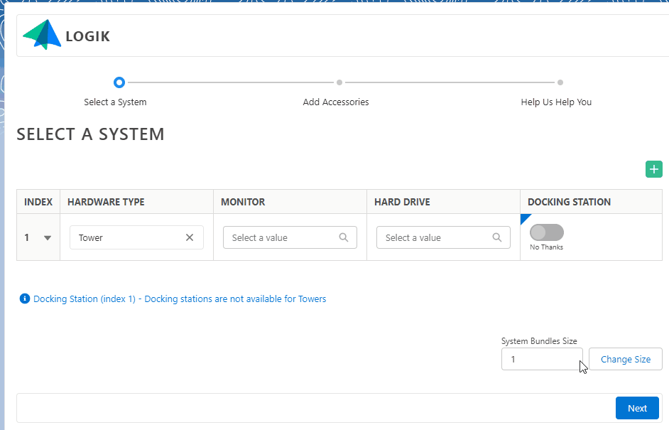
In the configurator, when we select any Tower as the Hardware Type, this info message will appear next to the disabled option for the Docking Station. This customizability and field targeting ensures there is no ambiguity as to what caused the message, where it applies, or what to do next.
As previously shown while building a custom layout, the Pages (equivalent to Path for those more familiar with the Salesforce Lightning terminology) provide the ability to guide the quoting user through the required steps. We can apply custom labels to these pages as well, and completion of the inputs will show advancement along the Path. I really like this as an alternative to horizontal tabs as it gives a better visualization of the quote journey (not to mention a sense of accomplishment along the way).
Throughout the quoting process, there is also a current status indicator shown that indicates whether or not the quote is in a valid state (able to be saved). If the quote is valid, then a green check is available and the ability to save to Quote is active. If there is a problem, a red ‘x’ is displayed along with the error messages, and the Quote button is disabled.

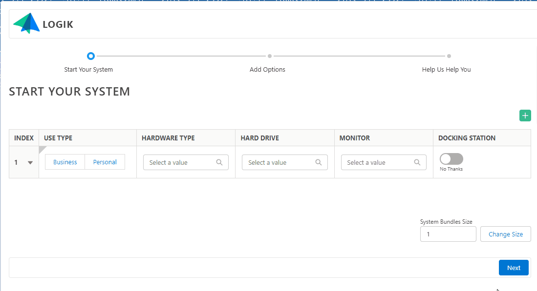
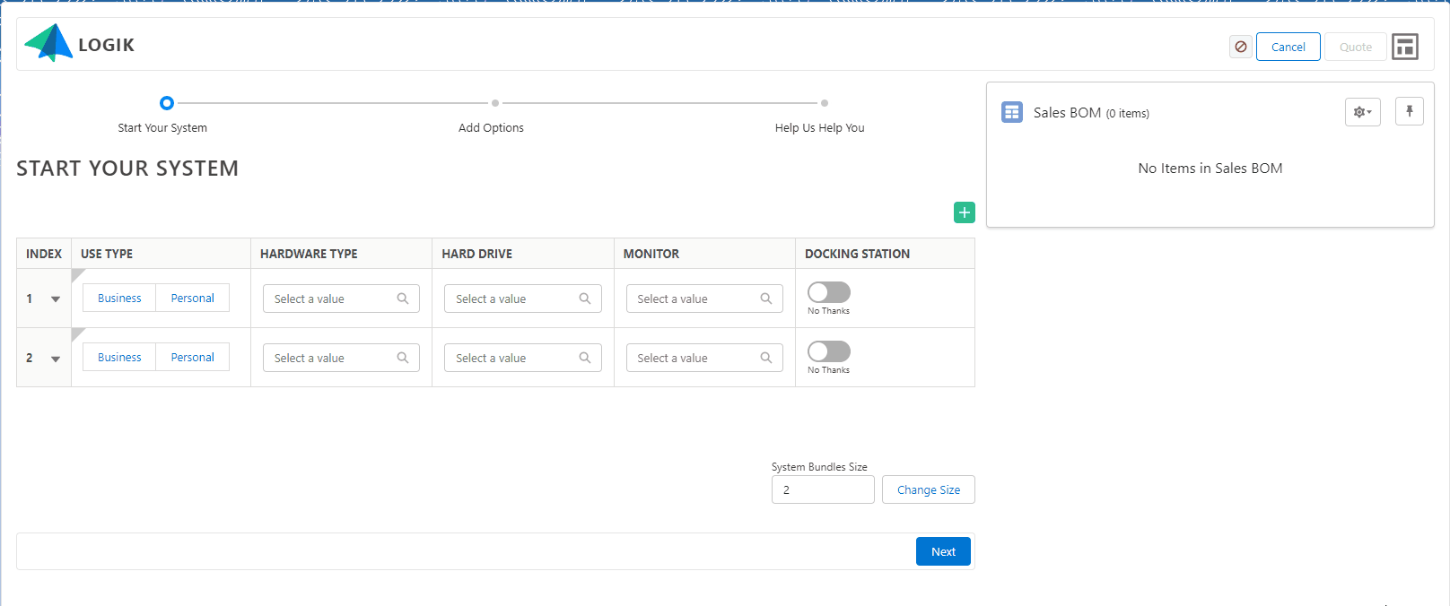
Lastly, let’s look at a new field bundling option referred to as Sets. This allows the administrator to group related field into bundles and repeat these bundles as needed. The quoting user can also add or remove bundles if required. This is really useful for displaying related fields and selections together. The feature could really be shown off in scenarios like configuring server arrays, or bundling mobile packages for a family or business, but our workstation builder example should do an adequate job of at least demonstrating the basic functionality.
Notice below that based on the selections made in the configuration, the rules engine is adjusting picklist options, adjusting default values, setting messages, and adding products with no lag whatsoever. As we make these additions, notice that Product List / Shopping Cart is populating real time, so that we can see the immediate impact of our selections on the resultant parts and price. Logik is also adding enhanced tooling around calculating and controlling pricing within the configurator itself, so that there is pricing transparency throughout the quoting process. Lots more to come!
Wrapping Up
The capabilities of Logik.io continue to grow, and I’m excited to see where the product goes next. Thanks for reading, and check out Logik.io if you’re looking to supercharge your configuration experience.

